Print design is a powerful medium for communicating messages, establishing brand identity, and leaving a lasting impression. Unlike digital graphics, print materials require close attention to detail to ensure colours, layout, and typography translate perfectly from screen to paper. Understanding the creative process behind print design and applying best practices can help you produce visually stunning and effective printed materials.
The Creative Process of Print Design
1. Defining the Purpose & Audience
Before diving into design, it’s essential to understand the purpose of the printed piece and who it’s intended for. Are you creating a high-end brochure for luxury products or an eye-catching flyer for an event? The target audience and messaging should guide design choices, from colour selection to typography and layout.
2. Concept Development & Layout Planning
A strong concept lays the foundation for impactful print design. Sketching rough layouts helps visualise how elements will fit together. At this stage, it’s important to consider:
- The flow of information
- Balance and hierarchy of text and images
- Branding consistency
3. Choosing the Right Typography & Colours
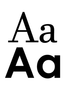
Typography plays a significant role in readability and aesthetics. Selecting the right font pairings and sizes ensures clarity and impact. Colour choices should align with brand identity and evoke the right emotions. Keep in mind:
- CMYK colour mode is used for print, not RGB (which is for digital screens)
- Pantone colours ensure precise colour matching
- High contrast improves legibility
4. Selecting High-Quality Images & Graphics
Printed materials demand high-resolution images (at least 300 DPI) to avoid pixelation. Vector graphics are preferred for logos and illustrations, ensuring crisp, scalable results. Professional photography or well-crafted illustrations can elevate the design significantly.
5. Preparing Print-Ready Files
Once the design is finalised, the artwork must be prepared for printing. Key considerations include:
- Adding bleed (typically 3mm) to prevent white edges after trimming
- Using correct file formats (preferably PDF)
- Embedding fonts or converting them to outlines to avoid missing text issues
- Checking colour accuracy with soft or hard proofs
Practical Tips for Stunning Print Design
- Keep It Simple: Avoid clutter by using ample white space and focusing on essential elements.
- Ensure Readability: Use contrast and hierarchy to make key information stand out.
- Think About Material Choice: The texture, weight, and finish of the material used impacts how the final design looks and feels.
- Consider Special Finishes: Foil stamping, embossing, and spot UV coatings for paper collateral add a premium touch.
- Test Print First: Always review a test print to catch any errors before full production.
How SignoDraw Can Help
At Signosaur, we understand not everyone has the time or expertise to create high-quality artwork for print. That’s where SignoDraw’s Artwork Services come in. Our expert design team can develop professional artwork tailored to your needs, ensuring your print materials reflect your brand identity while adhering to industry standards. Whether you need a fresh concept or adjustments to existing artwork, we’ve got you covered.
Bringing Your Print Designs to Life with Signosaur
At Signosaur, we specialise in transforming creative ideas into high-quality print materials that captivate and inspire. Whether you need brochures, business cards, banners, or promotional materials, our expertise ensures your designs translate flawlessly from concept to print. Contact us today to bring your vision to life with precision and excellence!
FAQs
What are the key elements of effective print design?
Effective print design combines typography, colour, imagery, and layout to create visually appealing and impactful materials. Consistency, readability, and balance are crucial to ensuring a design is both aesthetically pleasing and functional.
How do I choose the right fonts for my print materials?
Font choice plays a significant role in readability and brand perception. Sans-serif fonts are often used for modern, clean designs, while serif fonts can convey tradition and professionalism. Avoid overly decorative or hard-to-read fonts for body text, and maintain a clear hierarchy in your typography.
What’s the difference between CMYK and RGB, and why does it matter?
CMYK (Cyan, Magenta, Yellow, and Black) is the colour mode used for print, while RGB (Red, Green, Blue) is for digital screens. Designing in CMYK ensures colours appear accurately in printed materials, avoiding unwanted colour shifts when transitioning from digital to physical formats.
How can Signosaur help with my print design needs?
Signosaur offers professional SignoDraw Artwork Services, where our expert designers can create custom artwork tailored to your branding and print needs. Whether you need brochures, business cards, or large-scale prints, we ensure your designs are print-ready and visually striking.
What are some common mistakes to avoid in print design?
Some common mistakes include using low-resolution images, neglecting bleed and margins, overcrowding the design with too much text, and ignoring font readability. Working with a professional designer or print service, like Signosaur, ensures high-quality, polished results that align with your vision.


