
Your brand’s visual identity is more than just a logo – it’s the colours, typography, imagery, and style that define how customers see and remember you. Signage is one of the most powerful tools to bring that identity into the real world. When done right, it creates a consistent and memorable brand experience across every touchpoint.
Why Visual Identity Matters in Signage
A strong visual identity builds trust and recognition. Customers can instantly identify your business when they see the same design elements across your website, social media, and physical signage. Consistency communicates professionalism and helps customers feel confident in your brand.
Seamlessly Integrating Your Brand
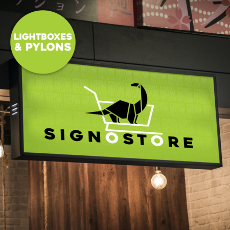
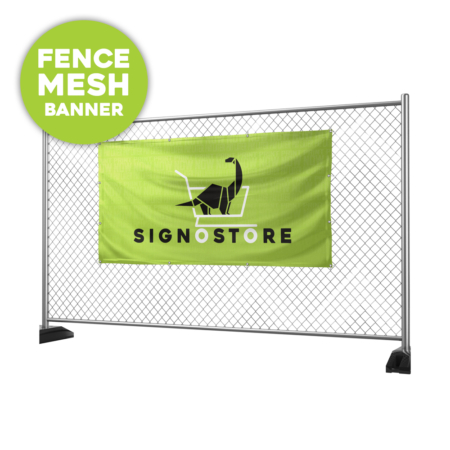
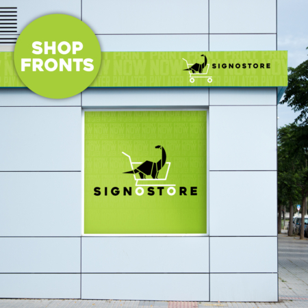
Your signage should feel like a natural extension of your brand, not an afterthought. Using your established brand guidelines ensures every sign – from shop fronts and reception displays to vehicle wraps and promotional banners – tells the same story and reinforces the same values.
Key elements to focus on include:
- Colours: Use your brand palette to create instant recognition.
- Typography: Consistent fonts reflect professionalism and reliability.
- Imagery & Graphics: Visuals should align with your brand tone, whether bold, playful, sleek, or minimal.
- Logo Placement: Position your logo clearly and consistently without overpowering the design.
Creating a Memorable Experience
Signage isn’t just about being seen – it’s about being remembered. A cohesive visual identity across all signage ensures customers connect every interaction back to your brand. Over time, this recognition builds familiarity, loyalty, and trust.


FAQs
How does signage reinforce a brand’s visual identity?
Signage reinforces visual identity by using consistent colours, fonts, and logos across all designs. This consistency strengthens brand recognition, makes your business more memorable, and helps customers connect signage with your overall brand experience.
Why is visual consistency important in signage?
Visual consistency is important because it builds trust and professionalism. When customers see the same design elements across signage, websites, and marketing, they recognise your brand instantly and are more likely to view your business as reliable and credible.
What elements should be included in signage to reflect a brand identity?
Signage should include brand colours, typography, logos, and imagery that align with your style. For example, bold colours and modern fonts may suggest energy and creativity, while sleek designs and minimal typography may reflect sophistication and professionalism.
Can inconsistent signage harm my brand?
Yes, inconsistent signage can confuse customers and weaken brand recognition. When design elements don’t match your overall visual identity, it reduces professionalism and makes your business less memorable, which can negatively impact trust and customer perception.
How can I make my signage align with my digital branding?
To align signage with digital branding, apply the same brand guidelines used online – including colours, fonts, and logo placement – to physical signs. This ensures a cohesive brand experience across all platforms, whether customers engage with you online or in person.
Blogs
Signosaur Pty Ltd parent company is now Truepenny Projects Group Pty Ltd trading as Signosaur.

